 |
|
You are not logged in! F.A.Q Log in Register |
 |

|
 |
...and 145 guests Last 5 registered Oplandisks nothingstar N_loop yipe foxtrotromeo Browse members... |
 |
Messages 2619908 Today 0 Topics 127961 |
|
|||||||||
| |||||||||
|
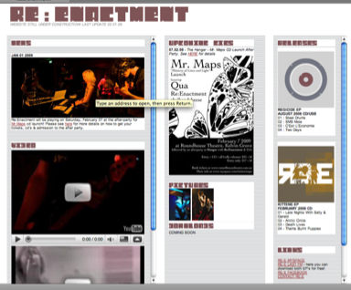
hey guys... been at this all day, was just wondering if you guys could maybe quickly look over this site i made today for my band... if you'd be so kind as to point out if you spot any malfunctions with your browser etc... just tested it on firefox & ie at the moment... anyhow let me know if you think it's not up to scratch as well etc cheers james :) |
|||||||||
|
|
|||||||||
| |||||||||
|
i like it, it reminds me a bit of muisc.org back in the day, with the iframes. maybe you should try to do something with the scrollbars. and maybe throw the gfx text into illustrator for extra sharpness, they look a bit blurry. |
|||||||||
|
|
|||||||||
| |||||||||
|
actually the scrollbars have been annoying me for the last hour and i can't figure out how to change the sizing... i know i can change the colour etc... what do you mean by gfx text? at the moment, it would just be the default scrollbars of your browser etc... i think?! |
|||||||||
|
|
|||||||||
| |||||||||
|
scrollbars look ok to me (using safari on mac) |
|||||||||
| Attached picture | |||||||||

|
|||||||||
|
|
|||||||||
| |||||||||
|
multiple scrolly things annoy me a lot. Why not have 3 DIVs on the page and scroll the whole page instead of how it is now? Also at 1400x1050 resolution (which is pretty average size on my 15" Thinkpad screen) there is a massive amount of unused space to the right hand side. Using a tape measure, 180mm is the width of the main block and 110mm is the size of the blank bit on the right. At least put some zilty "bonus" pixels or something there. |
|||||||||
|
|
|||||||||
| |||||||||
|
your typography is blurry, it should be sharp instead, this is a thing that photoshop does and makes it absolutely useless to render text in. yes, currently you are using the standard scrollbars (which generally isnt a bad thing), i was just suggesting that it could add something to the design. |
|||||||||
|
|
|||||||||
|
Messageboard index
|
|||||||||

